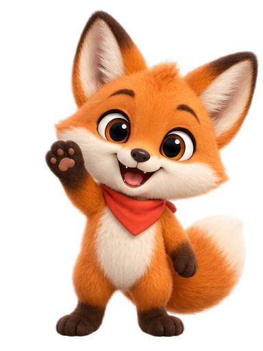
What actually happens to your image
It helps to know the pipeline, because it explains every recommendation that follows. When you upload an image instead of typing a description, the studio does not animate the pixels you uploaded. It uses the image as a reference to draw a new character design in the visual style you choose, shows you that design, and only after you approve it does it generate the motion from the approved design.
That intermediate step is the reason image-based characters come out clean. Animating an arbitrary image directly tends to smear text, warp logos, and invent limbs where the source was ambiguous. Redrawing first produces a character with a consistent construction (a known head shape, known limb positions, a resolved silhouette) that the motion stage can move convincingly. It also gives you a checkpoint: if the redraw lost the thing you care about, you regenerate the design for a credit rather than discovering the problem in the animation.
The practical consequence: the animation will be recognisably your character, not a pixel-exact copy. Identity survives; incidental details may not. Choosing the right reference and the right style is how you control which is which.
Choosing the reference image
The reference is the single biggest lever you have. A good one produces a keepable design on the first or second try; a poor one costs three or four regenerations and still disappoints. Work through this list before uploading:
| Property | Aim for | Why it matters |
|---|---|---|
| Subject count | Exactly one character | Two subjects produce a blend or a random pick. |
| Background | Plain, or easily separable | Busy backgrounds leak into the design as props, colours, or texture. |
| Framing | Full body, or at least head to knees | Anything below the crop is invented; a head-only reference cannot inform a dance. |
| Pose | Neutral, standing or sitting, arms visible | Extreme poses get baked into the design and fight later motions. |
| Angle | Front or three-quarter | Profiles hide half the face; the redraw has to guess the other half. |
| Resolution | 1000 px on the long edge or more | Small features (eye highlights, a logo mark) blur below this and are then omitted. |
| Lighting | Even, no hard shadows | Dramatic light reads as part of the character and reappears in every animation. |
| Overlays | No text, watermarks, or UI | Text is either garbled or turned into a pattern on the character. |
| Held objects | None, unless essential to identity | Objects must be re-drawn in every frame and limit what the hands can do. |
If your only version of the mascot is a logo lockup with text, crop the character out, extend the canvas with plain colour, and upscale it to at least 1000 pixels. Five minutes in any image editor saves several credits. If the character exists only as a tiny favicon or a 64-pixel sticker, it is usually faster to describe it in words than to upload it; the prompt-writing guide covers how.
Picking a style that respects the original
The style you select is applied to the redraw, so choosing well means choosing the style closest to the source. A flat vector mascot pushed through Soft 3D becomes a plush toy version of itself: sometimes a delightful upgrade, sometimes a betrayal of the brand. Rough guidance:
- Vector or logo-style mascot → Flat keeps it faithful; Soft 3D produces a “premium” reinterpretation worth trying as a second design.
- Painted or textured illustration → Stylized preserves the hand-made feel best.
- Manga or anime-style art → Anime, obviously; Stylized if the source is more Western-cartoon.
- 3D render or plush toy photo → Soft 3D. It is the only style that keeps the material.
- Photograph of a person → Soft 3D for a friendly caricature, Anime for a stylised avatar, Flat for a corporate-illustration look. None of them produce a photoreal double, and that is the point; see the portraits section.
A cheap experiment when you are unsure: generate the design in the “faithful” style and in one adjacent style, put both next to the original at the size they will actually be used, and ask someone who knows the brand which one is “still him”. People answer that question instantly and reliably.
Animated avatars from a portrait
Uploading a photo of yourself follows the same pipeline with one difference in expectation: the result is an illustrated avatar that resembles you, not an animated photograph. Hair shape, glasses, skin tone, beard, a signature jacket colour, the general face shape: these carry across. Exact facial geometry does not, which is what makes the result feel like a friendly caricature rather than a deepfake, and is usually what people want for an about page, a course intro, a stream panel, or a conference bio.
Photo-specific advice:
- Use a photo from the chest up or wider, facing the camera, with a relaxed expression. Passport-style flatness works better than a flattering angle.
- Wear the thing you want the avatar to wear. The redraw treats clothing as part of identity.
- Remove sunglasses and hats unless they are part of your look; they hide the features the redraw most needs.
- Plain wall behind you. Bookshelves become a texture on the character.
- Only upload photos of yourself or of people who have agreed. The terms cover this, and it is also simply the right thing to do.
The motions that suit personal avatars are the quiet ones: a wave, a thoughtful nod, “sip from a mug and look up”, “type on a laptop then look at the camera”. Energetic dances read oddly on a caricature of a real person unless the person is famous for dancing.
Refreshing a legacy brand mascot
A special and common case: the company has had a mascot for years, drawn once, used as a static image everywhere, never animated because nobody could justify the cost. Animating it is less a technical question than a brand one, so a few notes from the brand side:
- Decide up front whether this is a refresh or a reproduction. A reproduction wants the closest style and the most faithful reference. A refresh is permission to modernise proportions and finish, and it should be announced internally as such so nobody is surprised.
- Collect the best existing artwork, not the most common. The high-resolution master from the original designer, if it exists, beats the version everyone uses in slides.
- Generate the design, then stop and circulate it. Approval is the moment the character is locked for every future animation. It is worth a day of stakeholder feedback, because changing the design afterwards means new animations.
- Start with Idle and Wave. They are the least controversial motions and the most useful, and they let the organisation get used to the character moving before anyone sees it dance.
The app mascot guide has a section on building a five-clip motion system from one design, which is the natural next step once the refreshed character is approved.
Writing a custom motion prompt
The presets (Wave, Bounce, Dance, Idle, Jump) cover most product moments. Custom motions are where an image-based character becomes specifically yours: the bear that hugs its coffee cup, the hare that unfolds a map. A motion prompt is short, and it obeys a few constraints that come from the medium: the clip is short (4 to 12 seconds, your choice), square, and the camera does not move.
The structure that works:
[One action], [how it is performed], [what the character feels], [where it ends].Guidance that follows from the short, fixed-camera format:
- One action with a beginning and an end. Six seconds is a gesture, not a scene. If you have two ideas, make two animations; they cost one credit each and each becomes a reusable clip.
- Keep the character in place. “Walks across the frame” leaves half the clip empty or cuts the character at the edge. Motion on the spot (turning, reaching, bouncing, sitting down) uses the square frame well.
- Name the pace. “Slowly”, “in a quick burst”, “with a bounce”. Without a pace word the motion defaults to medium-everything.
- Name the feeling, once. “Shy”, “proud”, “sleepy” shapes the whole body. One feeling per clip; two feelings in one short clip looks like indecision.
- Say where it ends if you plan to loop the clip: “returns to a relaxed standing pose” makes the last frame close to the first, and the loop seam nearly invisible.
- Objects should be small and simple. A mug, a book, a slice of cake. Avoid anything with text, fine structure, or moving parts of its own.
A short set of prompts that consistently work well, grouped by what they are for:
- Loading state: “Taps a foot and glances at a wristwatch, mildly impatient, then looks up hopefully.”
- Success: “Pumps one fist in a quick, proud little celebration, then settles back with a satisfied smile.”
- Empty state: “Looks around curiously, shrugs with both shoulders, and gestures invitingly to the right.”
- Good night: “Yawns widely, rubs one eye, and slowly curls up to sleep.”
- Streak day: “Bounces twice with excitement, then holds up one finger triumphantly.”
- About page: “Sips from a mug, looks up at the viewer, and gives a friendly, relaxed nod.”
When the result is not right
- The design lost the signature feature. It was probably too small or low-contrast in the reference. Crop tighter, upscale, or add a one-line description alongside the image naming the feature explicitly (“note the single white ear tip”).
- The design picked up something from the background. Remove the background from the reference before uploading. Even a crude cut-out on a flat colour helps.
- The proportions changed. Style mismatch, most often a flat source in Soft 3D. Regenerate in Flat or Stylized.
- The animation invents a prop, or the hands do something odd. The motion prompt implied an object or an action the design cannot support. Simplify to one action, and remove any object that is not essential.
- The character drifts toward the edge or the camera seems to move. The prompt described travel. Replace “walks”, “runs”, “flies across” with on-the-spot equivalents.
- The loop pops. The start and end poses differ. Add a return-to-rest clause to the prompt, or use the Idle preset for anything that must loop indefinitely.
- The generation failed. The credit is refunded automatically; retry, and if it fails twice, change the prompt rather than retrying a third time. Retries reuse saved intermediate work where possible so a retry is usually faster than the first attempt.
After the animation exists
Every finished animation is exported at once as transparent WebM, ProRes 4444 MOV, transparent GIF, and MP4. For a website the WebM goes into a looping video element; for video work the MOV drops onto a track above your footage, and the editor guide shows the exact steps in Premiere Pro, Final Cut Pro, DaVinci Resolve, and CapCut. For a slide deck or a chat message, the GIF.
Because the approved design is fixed, you can return next month, type a new motion prompt, and get a clip of the same character. That is the real payoff of animating from an image: the mascot you already had stops being a picture and becomes a cast member you can direct.