What the evidence actually says about characters
Mascots have a reputation problem among serious product people: they look like marketing fluff. The research on advertising characters, which is the best-studied version of the question, points the other way. A Moving Picture Company analysis of long-running campaigns from the IPA effectiveness databank found that campaigns featuring a character were associated with materially higher business outcomes: a profit gain in roughly 34% of character-led campaigns versus 26% for those without, new-customer gains in about 41% versus 32%, and campaigns without a character were less than a third as likely to report a market-share gain. Separate industry surveys since have reported loyalty-score improvements after a mascot introduction in the high teens to low twenties of percent.
Those are advertising numbers, not app numbers, and they measure long-term brand campaigns rather than an owl in an onboarding flow. But the mechanism they describe transfers directly. A character does three things a logo cannot:
- It gives feedback a face. An expression is processed faster than a sentence. “Correct” in green text is information; a character punching the air is information plus a feeling.
- It creates a relationship to protect. People do not feel bad about letting an app down. They can feel slightly bad about letting a character down. Duolingo’s owl is the canonical example: its notifications work because the sender is somebody, not something.
- It compresses brand into something memorable. Users forget colour palettes; they remember the ghost that says good night.
Duolingo’s own account of its design language is instructive: Duo has a defined set of emotional states (happy, sad, frustrated, celebrating, and in the streak-loss case, theatrically dead), and each state is tied to a specific product moment. The character is not drawn once and reused everywhere; it is a vocabulary. That is the model worth copying, and it is the reason this guide is organised by moment rather than by screen.
The eight moments where a character changes behaviour
Every product has a handful of moments where the user’s emotional state is in play and a small nudge changes what they do next. These are the places a character belongs. Everything else is optional at best.
| Moment | What the user feels | What the character should do | Fitting motion |
|---|---|---|---|
| 1. First open | Curious, slightly wary | Welcome, then get out of the way | Wave, once, not looped |
| 2. Empty state | Lost, or unsure what to do | Point at the one action that matters | Idle, with a glance toward the button |
| 3. In-progress feedback | Focused | Acknowledge without interrupting | Idle or subtle Bounce |
| 4. Milestone | Proud, wants recognition | Celebrate proportionally | Jump for small wins, Dance for big ones |
| 5. Waiting or loading | Impatient | Show that something is happening | Idle loop, or a custom “tinkering” motion |
| 6. Recoverable error | Frustrated, possibly blaming themselves | Take the blame, show the way out | Custom: “shrug apologetically” |
| 7. Comeback after absence | Guilty, tempted to quit | Glad to see them, no lecture | Wave, warm rather than energetic |
| 8. Streak or habit moment | Invested | Mark the day, make the next one feel close | Bounce; escalate to Dance at round numbers |
Notice the pattern in the motion column: the character is loud exactly twice (milestones and round-number streaks) and quiet everywhere else. Products that get mascots wrong invert this. The character dances on the home screen every day and has nothing left to give when the user finally finishes the course.
Two moments are deliberately absent. Payment failures and destructive confirmations are not the place for a face; a cartoon reacting to a declined card feels flippant, and a character next to “Delete account” reads as manipulative. Draw those screens without the mascot, and the character’s appearances elsewhere gain weight by contrast.
Empty states deserve their own section
The empty state is the most consequential screen most teams never design. It is what a new user sees before they have done anything, which means it is the moment with the highest drop-off and the most room to help. It is also the natural home for a character, because there is nothing else on the screen to compete with.
The rule of thumb from designers who have written about this well is two parts instruction, one part delight. The character is the one part. The two parts are a headline that says what this space will hold and a single, prominent action that starts filling it. Concretely:
Once the user adds their first item, the character should leave that screen. A mascot that lingers beside a populated list becomes wallpaper, and wallpaper is where characters go to lose their meaning.
Loading and “all done” states are close cousins. GitHub’s empty notifications screen, with its mascot enjoying a walk, is remembered precisely because it appears only when the user has cleared everything: the character marks an achievement, not an absence.
Write a personality sheet before you draw anything
Visual design decisions get easier, and the motion choices above become obvious, once the character has a defined temperament. A personality sheet is one page, and it should exist before the first prompt is written or the first sketch is commissioned. It has five parts:
- Three adjectives. Pick them from different axes: energy (calm ↔ excitable), warmth (dry ↔ affectionate), competence (goofy ↔ capable). “Calm, affectionate, capable” produces a very different owl from “excitable, dry, goofy”.
- One flaw. Perfect characters are forgettable. A companion who is slightly clumsy, or a little too proud of small wins, has something to animate.
- One thing it never does. Never sad, never sarcastic, never still. This single constraint prevents the most common off-brand moments later.
- Its relationship to the user. Guide, teammate, pet, peer, or coach. This decides whether the character looks at the user or at the task, and whether it celebrates with them or for them.
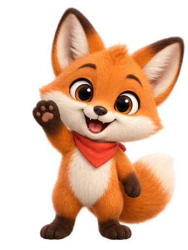
- Its silhouette in one sentence. The shape a user should recognise at 32 pixels: “a round fox with a bandana and one ear folded.” Everything in the design serves that sentence.
The sheet becomes the source for the design brief and, later, for every motion request. When someone asks for a “celebration” six months from now, the sheet answers whether that is a fist pump or a shy little hop. If you are generating the design with AI, the sheet also becomes the backbone of the prompt; the prompt-writing guide shows how to turn these five items into a description that produces a keepable character.
From one drawing to a motion system
A single illustration is a logo. A mascot is a small library of states that share one design. The minimum viable set for most apps is five clips:
- Idle: the default. Breathing, blinking, a shift of weight. Looped everywhere the character is merely present.
- Greet: a wave. Played once on first open and comebacks.
- Small win: a bounce or hop. Task complete, item added, day logged.
- Big win: a dance or leap. Reserved for milestones.
- Oops: a shrug, a scratch of the head. Recoverable errors and “no results”.
Whether these clips ship as transparent video or as Lottie files depends on how the character is drawn, not on the product; the format decision guide settles that question in one section. Products with a habit loop add a sixth: a streak reaction that can escalate. Products with a waiting state add a busy loop that is visibly doing something (tinkering, reading, stirring) rather than idling, so the user knows the app is working rather than stuck.
The hard requirement is consistency: all of these must be unambiguously the same character. That is trivial when one animator draws everything and surprisingly hard otherwise, which is why a workflow that locks the design before any motion is generated matters so much. In the studio, approving the still design is what fixes the character; every animation afterwards is rendered from that approved design, so the five clips above come from five motion prompts rather than five illustrations. The how it works page describes the approval step; animating from an image covers the case where the design already exists.
The discipline that keeps a mascot likeable
The failure mode of app mascots is not ugliness; it is presence. Characters become annoying through frequency and volume, and the research on gamification has a name for the broader problem, streak creep: mechanics that motivate at first and, when pushed, start to feel like pressure. A few rules of restraint prevent most of it.
- Budget appearances per session. One greeting, at most one celebration, and idle presence on no more than two screens. If you cannot list where the character appears on one hand, it appears too often.
- Escalate, do not repeat. The tenth identical celebration is worth less than the first. Vary the motion by magnitude and save the biggest one for the rarest event.
- Let users turn it down. A “less animation” setting that swaps loops for stills is respectful, cheap to build, and used by fewer people than you fear, because the ones who stay opted in are the ones who like it.
- Never use the character to guilt. A sad mascot in a re-engagement notification tests well once and erodes trust after that. The same notification with a glad-to-see-you character is less punchy and ages far better.
- Keep it out of serious flows. Billing errors, account deletion, medical or financial results, anything legal. The absence is part of the character’s manners.
- Match motion to reading. On screens with long text, the character idles or is still. Motion in peripheral vision fights reading, and users will blame the app, not the character.
How to tell whether it is working
Do not try to measure “the mascot”. Measure the moments. Each of the eight moments above has a behaviour attached to it, and that behaviour is what the character exists to move.
- Empty state: the share of new users who complete the first action, and the time it takes them.
- Milestones: next-day return rate after a celebration versus after a plain confirmation, ideally as an A/B test on the celebration alone.
- Comeback: second-session rate among users who returned after a gap of a week or more.
- Errors: retry rate after an error screen, and the rate of support tickets that quote it.
- Everything: the opt-out rate on the “less animation” setting. If it climbs above a few percent, the character is appearing too often or moving too much.
Qualitative signals arrive sooner and are worth collecting deliberately: whether users name the character unprompted in reviews and support chats, whether they screenshot it, whether they ask for stickers. A character people name is a character that is working; a character nobody mentions is furniture.
One last calibration for teams weighing the investment: the cost side has changed a great deal. A five-state motion system used to be an agency engagement; the cost comparison lays out current freelance, agency, and AI-studio numbers so the decision can be made on the moments rather than the budget.