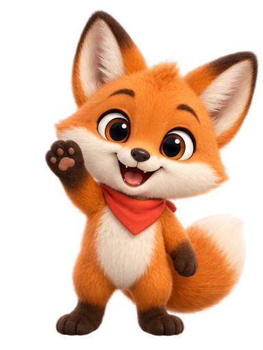
Why most character prompts produce the same character
Type “cute robot mascot” into any image model and you will get a competent, friendly, white-and-blue robot with round eyes. Type it again and you will get its sibling. The model is not being lazy; it is giving you the statistical centre of everything it has seen labelled “cute robot mascot”, and the centre is the same for everyone.
A prompt moves you away from that centre only where it is specific. Every concrete detail (a folded ear, a mustard scarf, a slightly too-big head) is a step toward a character nobody else has. Every generic word (“cute”, “friendly”, “modern”) is a step back toward the centre. The craft is knowing which details to spend words on, because a prompt with twenty details is as unhelpful as one with none: the model has to drop some, and it will drop the ones you cared about.
The good news is that character design prompts have a stable structure. Once you have written three or four using it, the fourth takes ninety seconds.
The six parts of a strong design prompt
In rough order of importance:
- Subject and body type. What it is, and its proportions. “A fox” is a start; “a small, round-bodied fox with a large head and short legs” is a character. Proportion words (round, lanky, squat, stocky, tall-eared) do more work than any other single choice, because they define the silhouette.
- One signature feature. The thing that makes it this character rather than a fox. A red bandana. One ear that flops. A single antenna with a bulb. Freckles across the snout. One feature, occasionally two. Three is a costume.
- Palette, named precisely. Not “orange” but “warm orange fur, cream chest and muzzle, dark chocolate paws”. Two or three colours plus an accent. If the character must sit on a specific brand colour, say what it should not be: “no blue anywhere” is more reliable than hoping.
- Expression and posture. The default mood, and the way the body carries it. “Slightly smug half-smile, chest out” and “soft, sleepy eyes, shoulders relaxed” are two different characters wearing the same fur. Because this design will be animated into many motions later, choose the neutral, resting version of the character’s personality, not a peak emotion.
- Material and finish. Matte felt, glossy plastic, soft short fur, paper cut-out, chalky clay. This decides how light behaves on the character and is the difference between a toy and a drawing. It interacts strongly with the visual style you pick (next section).
- Framing constraints. “Full body, facing slightly left, centred, plain background, no text, no props on the ground.” This part is boring and it prevents most re-rolls. Full body matters if the character will jump or dance; a cropped design cannot be animated below the crop.
Put together, a complete prompt reads like a paragraph, not a list of tags:
Around seventy words. That is the right size: long enough to be specific about everything that matters, short enough that nothing is dropped. If your prompt is over a hundred and twenty words, something in it is decoration.
How the four visual styles read the same words
The studio offers four styles at design time, and the choice changes more than the rendering. Each one has a different idea of what “fur” or “glossy” or “big eyes” means, and the prompt should lean into that rather than fight it.
| Style | What it communicates | Words that work well | Words to avoid | Typical home |
|---|---|---|---|---|
| Soft 3D | Toy-like, tactile, premium, friendly | Matte, felt, clay, rounded, soft shadow, subsurface, plush | Outline, flat, line art, sketch | Consumer apps, wellbeing, kids’ products, hero sections |
| Stylized | Expressive, illustrated, characterful | Exaggerated, chunky, hand-painted, bold shapes, textured | Photorealistic, realistic proportions | Games, streams, marketing, editorial |
| Anime | Youthful, emotional, story-driven | Clean line work, cel shading, large expressive eyes, dynamic hair | Fur texture, realistic lighting, matte clay | Communities, VTuber-adjacent brands, learning apps for teens |
| Flat | Modern, clear, corporate-friendly | Geometric, two-tone, minimal shading, simple shapes, vector | Fur, gloss, subsurface, rim light | SaaS, fintech, documentation, onboarding illustrations |
A useful test: write the prompt once, generate it in two styles, and look at which one keeps your signature feature legible at a small size. Flat almost always wins on legibility; Soft 3D almost always wins on warmth. Most product mascots end up in Soft 3D or Flat; most stream and game characters end up in Stylized or Anime.
Twelve prompts you can adapt
Each is written to the six-part structure and tuned for a style. Change the palette and the signature feature and it becomes yours.
Products and apps
- Habit tracker (Soft 3D): A compact, egg-shaped penguin with a tiny orange beak and oversized flippers. Wears a knitted teal beanie slightly too large. Slate-blue back, white front, soft matte plush finish. Resting expression: determined little frown, standing upright. Full body, facing slightly right, plain background, no text.
- Sleep app (Soft 3D): A drowsy, rounded ghost the size of a pillow, edges fading to soft wisps at the bottom. Holds a small brass candle lantern. Pale lavender body with a warm glow from the lantern, blush cheeks. Half-closed eyes, gentle smile. Matte, slightly translucent finish. Full body, centred, plain dark-blue background, no text.
- Fintech onboarding (Flat): A friendly geometric owl built from circles and rounded triangles. One eyebrow raised. Deep navy body, mustard chest, coral feet as the only warm accent. Two-tone flat shading, no outlines. Upright, full body, facing forward, plain background, no text.
- Developer tool (Flat): A boxy, upright robot with a single rounded antenna ending in a small green light. Charcoal body, off-white face plate, one green accent. Calm, slightly amused expression drawn as two dots and a small curve. Vector style, minimal shading. Full body, three-quarter view, plain background, no text.
- Language learning (Stylized): A chunky, energetic parrot with an exaggerated large beak and a tuft of three feathers. Wears a tiny backpack. Emerald green body, sunflower chest, a single red feather in the tuft. Wide grin, mid-step posture. Hand-painted texture, bold shapes. Full body, facing left, plain background, no text.
Marketing and content
- Coffee brand (Soft 3D): A round, sleepy bear cub hugging a paper coffee cup almost as big as its torso. Honey-brown fur, cream muzzle, cup in plain kraft brown. Blissful closed-eye smile. Soft short fur, matte. Full body, sitting, centred, plain background, no text or logo on the cup.
- Outdoor gear newsletter (Stylized): A lean, tall-eared hare in a rolled-sleeve flannel shirt and a folded map tucked under one arm. Grey-brown fur, red and black flannel. Squinting into the distance, weight on one foot. Textured, chunky brushwork. Full body, three-quarter view, plain background, no text.
- Kids’ snack (Soft 3D): A squat, wobbly blue blob with two stubby arms and a single curl on top. Bright cornflower blue, slightly translucent, glossy jelly finish. Enormous cheerful eyes, open-mouth grin. Full body, bouncing pose, centred, plain background, no text.
Streams, games, and communities
- Cosy gaming stream (Anime): A short, cheerful girl with a round face and large amber eyes, chin-length mint hair with one long strand that curls upward. Wears an oversized cream cardigan and a cat-ear headset. Warm, calm smile. Clean line work, cel shading. Full body, facing slightly right, plain background, no text.
- Competitive esports team (Stylized): A compact, muscular dinosaur with a stubby tail and a jagged crest of three spikes. Wears a black team jersey with no logos. Deep teal skin, lime crest and belly. Confident smirk, arms crossed. Bold graphic shapes, textured shading. Full body, facing forward, plain background, no text.
- Discord community (Flat): A round cat head-and-body with no visible neck, ears slightly too tall. A single lightning-bolt marking on the forehead. Charcoal grey with a violet bolt and violet inner ears. Deadpan expression, tiny mouth. Flat two-tone, no outlines. Full body, sitting, facing forward, plain background, no text.
- Indie game companion (Anime): A tiny, floating spirit shaped like a teardrop with a leaf growing from its head and stubby arms. Pale jade body, darker jade leaf, two large dark eyes with a single highlight. Curious tilt of the head. Cel shaded, soft outline. Full body, floating just above the ground, centred, plain background, no text.
The mistakes that produce generic or unusable characters
- Negations without alternatives. “Not scary” gives the model nothing to draw. Say what you want instead: “soft rounded features, small teeth hidden, warm eyes”.
- Describing a scene instead of a character. “A fox in a forest at sunset holding a lantern by a river” spends your budget on the forest. The design is the character; the scene comes later, in the motion.
- Peak emotions in the base design. A design drawn mid-laugh cannot look calm later. Ask for the resting expression; the animations will supply the laughing.
- Text, logos, and brand names. Models still render text unreliably, and a mascot with a misspelled name on its shirt is unusable. Add branding in your design tool afterwards.
- Lists of adjectives. “Cute, fun, playful, friendly, modern, professional” collapses to the centre. Replace the six adjectives with one concrete detail.
- Cropped framing. “Portrait”, “close-up”, or “bust” designs cannot be animated from the waist down. Always ask for full body unless you are certain every motion will be a head-and-shoulders gesture.
- Props the character must hold. A held object is a second thing to keep consistent in every animation and it constrains the motions available. Prefer worn accessories (bandana, beanie, backpack) over held ones (mug, sign, phone).
- Too many colours. Beyond three plus an accent, the character stops reading as one shape. If your brand palette is large, the mascot should use a subset of it.
Iterating without losing what worked
The first generation is rarely the one you keep, and the second is often worse, because people change everything at once. A disciplined loop looks like this:
- Judge the silhouette first. Squint, or shrink the design to the size of an app icon. If the shape is right, keep going. If not, change only the body-type words and regenerate.
- Then the signature feature. Is it legible at that small size? If not, make it bigger or higher-contrast in the prompt, not more numerous.
- Then palette and finish. These are the safest things to change late; they rarely disturb the silhouette.
- Expression last. Small phrasing changes (“half-smile” to “closed-mouth smile”, “eyes half-lidded” to “eyes wide”) have large effects and rarely require touching anything else.
Change one part per regeneration and keep a copy of every prompt that produced something you liked. In the studio each design costs a credit and the still design appears in under a minute, so a careful loop of three or four rounds is cheap; a careless loop of ten is not. Failed generations refund their credit automatically, which removes the main reason people hesitate to iterate.
Once a design is approved it is locked, and every subsequent animation is rendered from that exact design. That means you do not need to maintain a “character sheet” prompt and paste it into every later request, the way you would with a general-purpose image model. Your design prompt is used once; your motion prompts are short and separate. Writing those is a different skill, covered in the guide to animating a character.
A fill-in-the-blanks template
A [size] [body shape] [creature or object] with [one proportion cue].
[One signature feature, worn not held].
[Main colour] [body part], [second colour] [body part], [accent colour] [small detail].
Resting expression: [mood in 3–6 words], [posture in 3–6 words].
[Material] with a [finish] finish.
Full body, [three-quarter view facing left | facing forward], centred on a plain background, no text, no props.
Fill it in, pick the style whose vocabulary matches your material words, and generate. If you already keep a personality sheet for the character, the app mascot guide explains how its three adjectives and one flaw translate into the expression and posture line. If you would rather start from an existing drawing than from words, upload it instead; the studio uses the image as the reference and the prompt becomes optional.
New accounts start with three free credits, which is one design, one animation, and one spare regeneration: exactly enough to run the loop above once with a safety margin.